Data visualization turns numbers and statistics into clear, impactful visual stories.
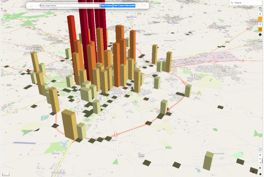
Check out a screenshot of our latest work: simple, intuitive, and powerful.
After creating machine learning models and obtaining predictions on air pollution, through our integration layer, the data was transformed into an interactive 3D map. The user can navigate, toggle different layers on and off, and get additional real-time information.
An important step toward a more immediate and accessible understanding of predictive data!